DiviGear introduces a new table module so you can showcase your data more efficiently with responsive design. With DiviGear’s table module, table creation will be effortless.
In this documentation, we aim to show you the features and capabilities of DiviGear’s table module.
Table Settings
When you select the Table module to use, the table settings window will appear.
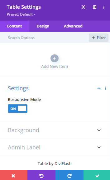
The Table Settings window has three tabs: Content, Design, and Advanced.
Under the content tab, you will see a plus icon that says Add New Item. If you want to create a table, click on this option.
Table Row Item Settings – Content
Clicking on this option will take you to the Table Row Item Settings window where you can create the columns, and rows and input the data of the table. This tab has all the options to individually edit rows and columns.
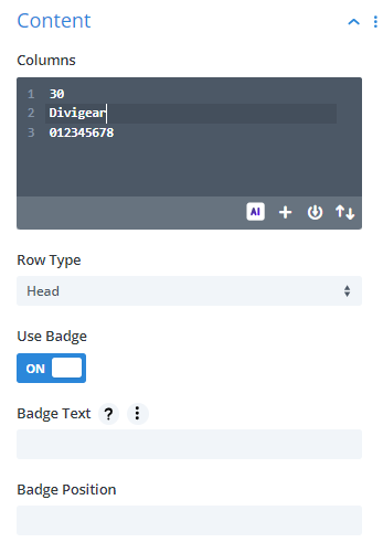
Content
- Columns: The first thing in the Table Row Item Settings is the Columns editor under the Content section. This is where you can input the data that will go into each column of the table.
Type in to input the data. The data you input in the first line will go to the first column of your table. Press Enter to create the second column and type in the data you want to input there and so on.
To create an empty column use the HTML code for space ( ). If you want to use an icon, use this code <span class=”et-pb-icon”> icon code </span>. You can find a list of icon codes from here.
To add more rows, go back to the Table Settings tab and add more rows by clicking on the (+) icon.
- Row Type: The next option is Row Type, where you can choose the type of row you just created. If it’s the first row, you need to choose Head, Foot if it’s the last row, and choose Body for the rest.
- Badge: For the head of the table, you can use a badge by turning the badge option on.
- Badge Text: Set the text for the badge.
- Badge Position: Choose the column where the badge will be positioned.
Table Options
The Table Options has two buttons-
- Enable Row Merge: Enabling this option lets you merge rows. Once you enable it, two fields will appear.
- Merge Row Item: Choose which row you want to merge. It accepts numerical input as the row number.
- Merge Row Item Value: Choose how many rows you want to merge.
- Enable Column Merge: The option lets you merge rows. When enabled, two fields will appear.
- Merge Column Item: Choose which column you want to merge. It accepts numerical input as the row number.
- Merge Column Item Value: Choose how many columns you want to merge.
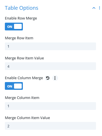
Note: For the head and the foot “Enable Row Merge” is disabled.
Label
You can give the module a custom label instead of a default one.
Table Row Item Settings – Design
The table can be visually customized using the options provided here.
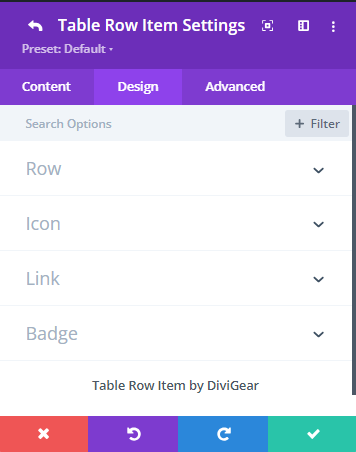
Row
Edit the row’s background color, font, text alignment, text color, text size, spacing, line height, text shadow, etc.
Icon
Change the icon color and size, add borders and cell margins, etc.
Link
Any links added to the table using HTML can be customized here. You can add a background, change the font, text size, etc.
Badge
If you’re using a badge, you can modify it from this section. You can change the background, and alignment, add margins and paddings, change font and text, etc. Also, by enabling the Full Width Badge option, you can make the badge as wide as the column.
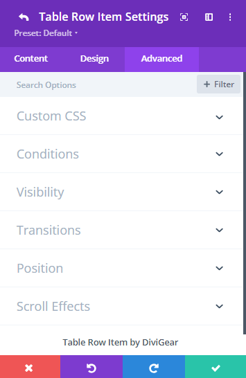
Table Row Item Settings – Advanced
This section has options to further customize your table rows and columns using CSS code.
Now that we have explored adding rows and columns and how to customize them individually, we will explore the Table Settings where we can modify the entire table.
Table Settings – Content
Right under the rows you have added you will find the following sections.
Settings
Turn on the Responsive Mode to optimize for mobile devices.
Background
You can add a background color, gradient, image, video, pattern, and mask.
Admin Label
You can assign a custom label to the module instead of the default one.
Table Settings – Design
Customize the visuals of the whole table from this tab.
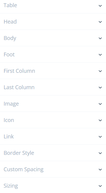
Table
You can customize the outermost border of the table and make the corners round.
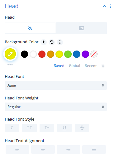
Head
Add a background color, change fonts, text alignment, text color, etc. to the table’s head.
Body
Change the background color, fonts, text alignment, text color, etc. of the table’s body. You can choose different settings for the odd and even rows of the table.
Foot
Change the background color, fonts, text alignment, text color, etc. of the table’s foot.
First Column
Customize the background, font, text, and border of the first column. You can exclude the head and the foot by enabling the Exclude Head and Foot option.
Last Column
You can choose a different background, font, text, and border for the last column and also leave out the head and the foot.
Image
If there is one or more images in the table, you can change their size, add a cell margin, and customize the border from this section.
Icon
Here you can customize any icon that is used in the table. The customization options include color, size, margin, borders, etc.
Link
HTML links can be customized here, including adding a background, changing the font, and changing the size of the text.
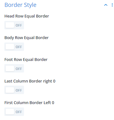
Border Style
Enable or disable different borders of the table.
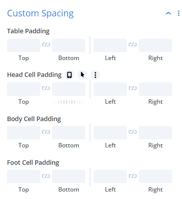
Custom Spacing
Add custom padding to the outermost border, head cell, body cell, and foot cell.
Sizing
Lets you customize the height, width, and alignment of the table module.
Spacing
Add margins and padding to the module.
Border
Change border style, and color, and apply rounded corners.
Box Shadow
Apply a shadow to the Data Table module.
Filters
Modify the colors that were applied to the module.
Transform
Make changes to the scale and position of the module.
Animation
Apply an animation effect to the Data Table module. Choose from 7 different styles of animation.
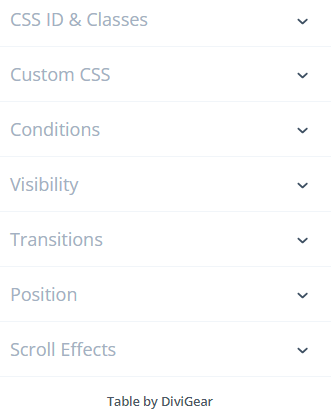
Table Settings – Advanced
The advanced section contains features that are common to every Divi module.
If you want to customize each item in the data table module using CSS, here are the customization options available to you.